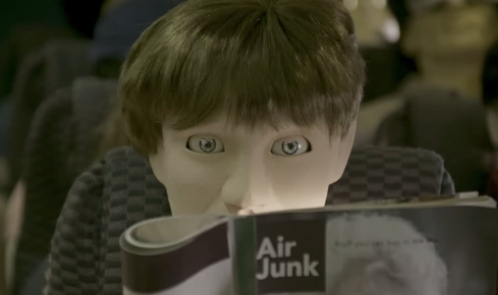
Would you watch an ad which is nearly six hours long? Virgin America is betting that you wonŌĆÖt even though they just rolled out an ad which clocks in at five hours and 46 minutes. The ad, if it can really be called that, highlights flying at its worst. Told with mannequins (extremely creepy ones at that), the ad shows the nightmarish hell that a long flight can be.
Watch - or skip around - if you dare.
This intentionally awful ad shows what life might be like on a normal flight. On a Virgin America flight, youŌĆÖll be able to enjoy ŌĆ£WiFi, entertainment, power outlets, mood lighting, and food and drinks on demand,ŌĆØ according to their YouTube channel.
What do you think of this ŌĆ”ad/movie/feature/thing? ItŌĆÖs creative in that fact itŌĆÖs going to get people talking (like we are now) about an ad which truly sucks and might be used for torture. Still, you may end up missing the overall message (Virgin AmericaŌĆÖs flights are super relaxing and comfortable) because youŌĆÖre so focused on the adŌĆÖs length, the creepy mannequins or the amazingly dull/boring video. Some people may not connect the dots and thatŌĆÖs a shame because this ad is definitely a different take on the usual ŌĆ£our planeŌĆÖs amenities are awesomeŌĆØ approach we are used to seeing on TV and online.


