


It’s amazing how much of a stir can be caused by a change of font. In Google’s case, the hoopla is warranted. It’s one of the world’s biggest companies and it’s visual marketing is based almost entirely on 6 letters. Any change of those letters is likely to be noticed because how much traffic the site receives.
Along with the new logo, Google rolled out new looking apps and a focus on a rainbow ‘G’ instead of the blue lower-cased ‘g’. For those wondering, the font switched from Serif Wordmark to Sans-serif. Google is also creating a holding company called Alphabet in a change of financial and corporate structure.

Here are a few more big companies that made small, but noticeable changes to their logos.
The newer logo is on the left.
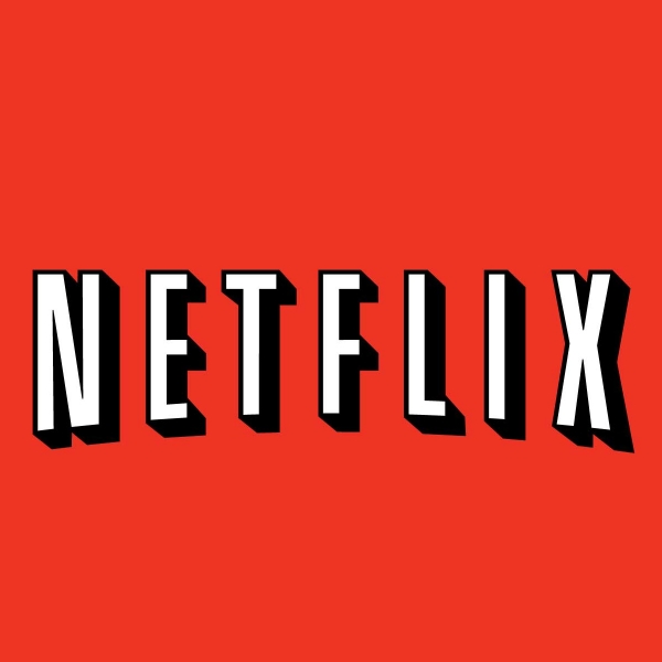
Netflix made the logo cleaner and less box office-y. The switch was a good one.
![]()
![]()
Paypal made a slight change. I do prefer the new one with the overlapping P’s with the nice semi-transparent look.
![]()
Domino’s ditched the pizza for a more inclusive logo. It’s nothing special but the change was overdue.