┬Ā ┬Ā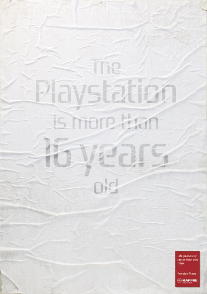
Mapfre Pension Plans is one of the largest insurance companies in Spain. In a recent print campaign, the company wanted to show people that retirement is approaching fast and how time passes more quickly than you might think. The result, the posters seen in this post, are effective in making the viewer feel old and depressed but the campaign's overall execution is a bit faulty.┬Ā
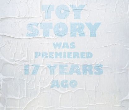
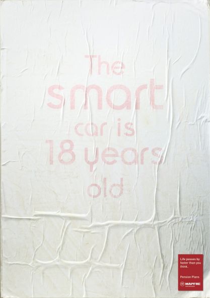
The company in charge of making the ads opted to make the posters look old and weathered to really drive home the "time has passed" feeling to the viewer. A fair strategy, but unfortunately the effect instead makes the poster quite difficult to read. Faded text on a white background is never a good idea. Add in the paper "ripples" and the whole thing is rather difficult to make out.┬Ā
 Poster one, the one up top on the left, reads: Toy Story was premiered 17 years ago.┬Ā
Poster two, the one up top on the right, reads: The Playstation is more than 16 years old.┬Ā
Finally, the third piece in this series, seen on the right, reads: The Smart car is 18 years old.┬Ā
In case you're skeptical, the facts check out. Toy Story was released in 1995. The Playstation came out in 1994. Finally, the Smart car one is a bit debatable but one of the associated dates is 1993.
It's hard not to feel old when looking these facts over. However, after reading them, did your brain shift to "insurance" or in this case "pension plan"? Probably not. Also, if you were walking down the street would your attention gravitate to these posters? Almost definitively not. Advertisers work by the belief that you have less than a fraction of a second to grab the viewer's attention. Was yours grabbed here by the tough to make out text and the weathered appearance? Probably not.
A decent concept but, as we have seen from numerous advertisers in the past, execution is everything. ┬Ā


