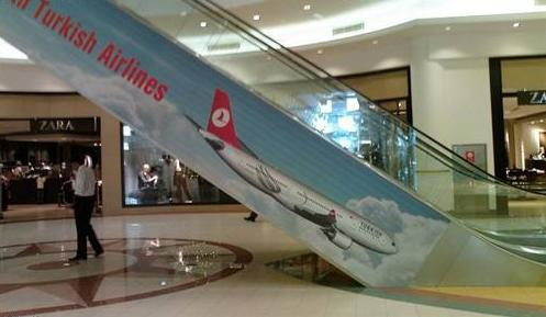
Turkish Airlines was recently named the "Best Airline in Europe" for the second consecutive year. Fortunately, the folks in charge of placing their advertisements aren't the same ones running the airline.┬Ā
Yikes. Someone made a pretty big mistake here. It's pretty obvious that this ad was supposed to show the place flying into the sky as opposed to heading straight for the ground. Was this a case of poor planning or, more realistically, was this a case of someone accidentally placing the wrap on the wrong side of the escalator?┬Ā
Consider this a great lesson for every advertising company out there: Your idea is only as good as the guy who assembles it.┬Ā
Credit to Reddit for this great advertising blunder.┬Ā


